Arete Student Academic Journal
Print Publication
Project Background
Arete has been a published journal of student work at St. Edward’s University for over 30 years now. It’s purpose is to provide experience in publishing for both the editorial team, design team, and those who submit work.
My Role
- Art Direction
- Layout
- Image Creation
- Typesetting
Working with the editorial team and junior designer, we set out to create the 28th edition of Arete. As senior designer, my role varied between art direction, theme, layout, image creation, and typesetting. We also had to communicate with the editors as well as the faculty advisor in order to make a cohesive journal.
Solution & Impact
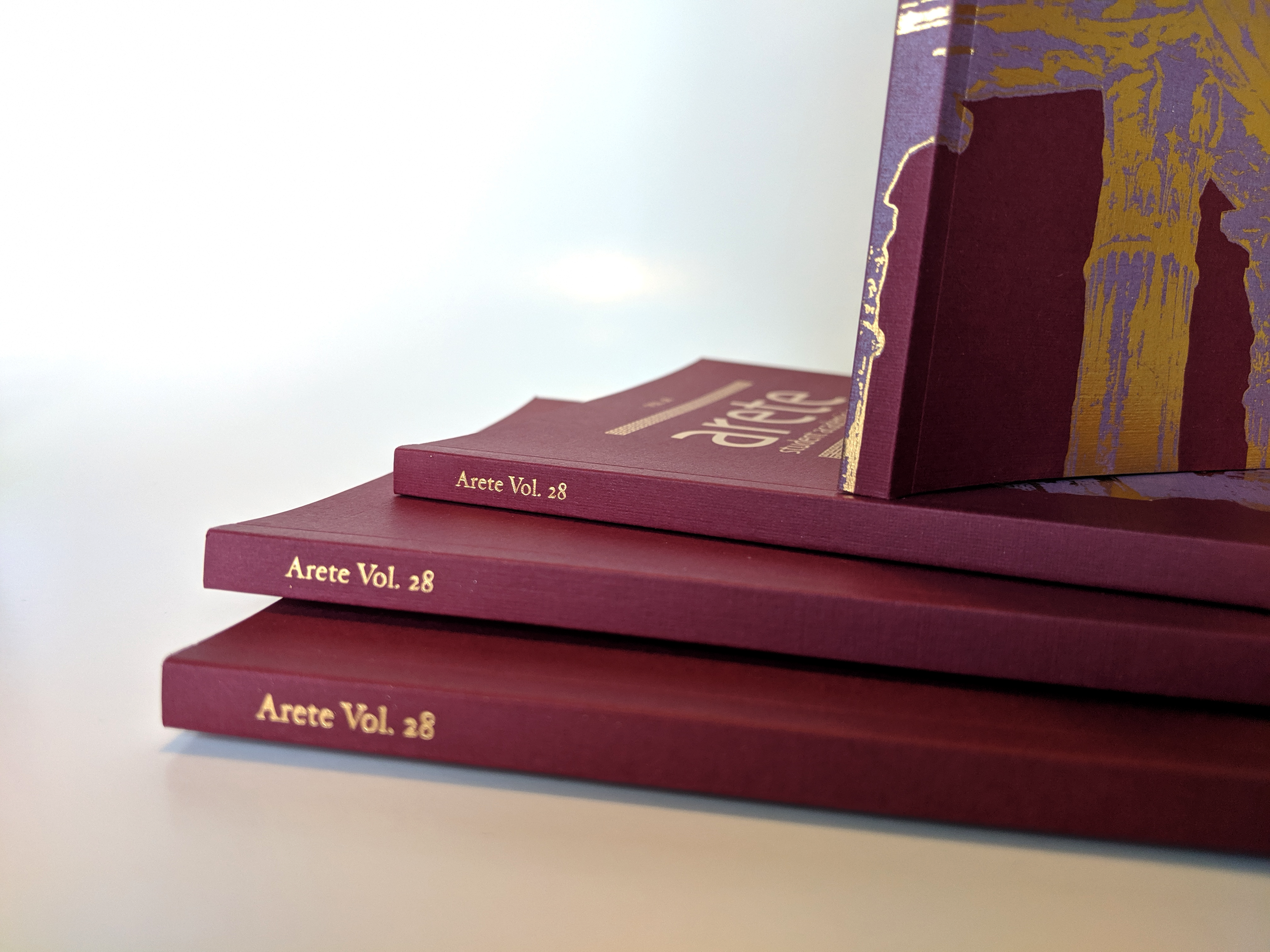
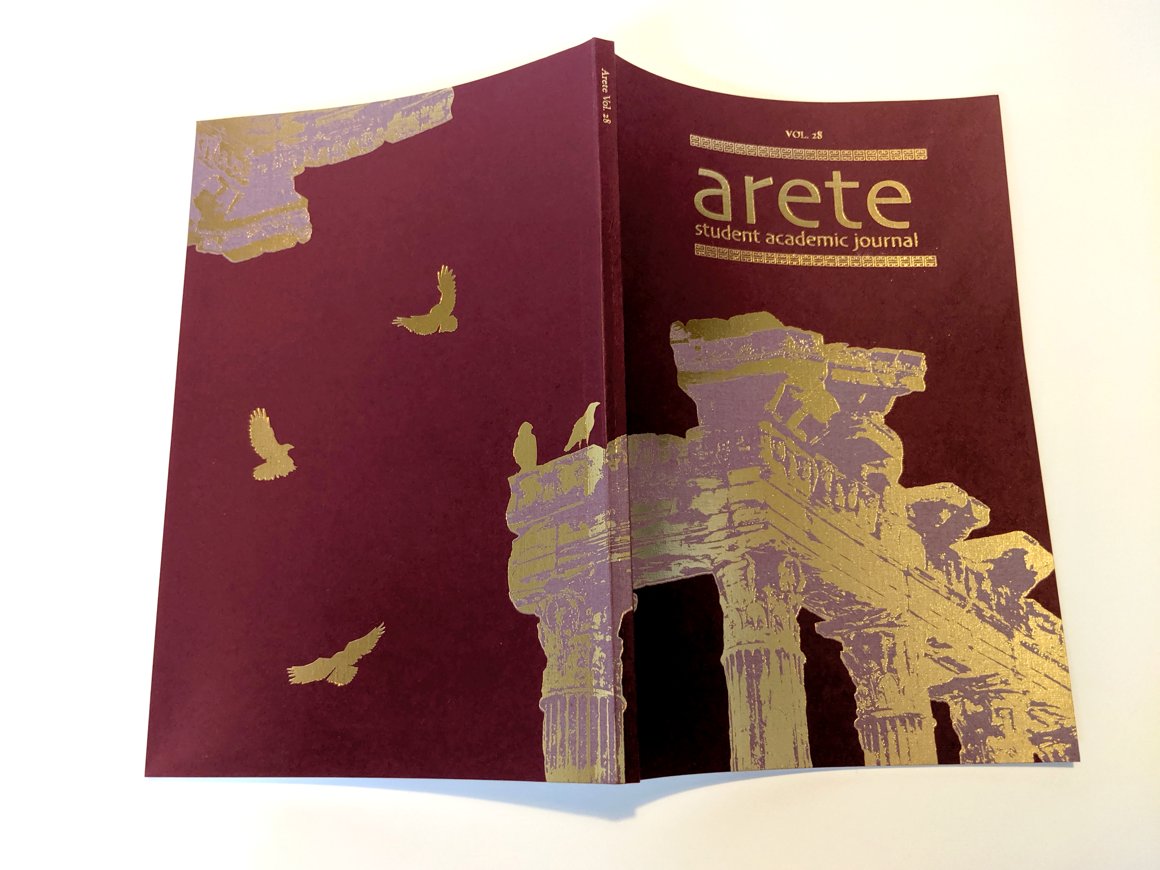
Myself and the junior designer decided the concept would be based on the greek background of the word “arete,” meaning excellence above all else. Through our research, we decided to use a classic Greek key motif thoughout and Greek architecture for images. The junior designer illustrated various muses to represent each piece of writing since a lot of them had themes of feminism.
For the typesetting we came to a conclusion of using a strong serif for the body text and a bold sans-serif for titles. There are five different writing pieces in the journal so the junior designer created five unique drawings to accompany each story. Paper choice was very important, since we wanted strong colors that would again, relate back to the greek theme.
We were lucky to be able to work directly with the printing company where we were able to choose a burgundy linen paper for the cover and a white vellum paper for the text stock. A gold foil was added to the cover further showing the meaning of ‘arete’.